Tips and Tricks for Website Design Success!

Last updated: 28 August 2020
If you're reading this it's likely that you're still pretty new to web development and design. If so, then perfect! You’re in the right place, and I hope you pick up some useful tips here.
If you've been at this for a while, stick around anyway. It never hurts to have a reminder - you might even learn something new.
In this blog, I want to address some of the aspects of web design that don’t usually get as much attention, and give my two cents on some of the aspects that do. All to help you build the best web design that you can.
You may be wondering if any of this is really that important. All I can say to that is yes - these points are important.
Why? Because the aspects of web design I’m going to talk about will make your content more accessible, your website easier to use, faster to load, and improve your user’s experience overall. Nothing turns people away like a bad user experience, and these seven tips will help keep those people around.
Increasing your audience means more leads will be generated and you’ll have better conversion rates. In turn, that ultimately means more sales for you and your company.
So without any more ado, let’s get into it shall we?
1. DO make use of white space
White space is one of the best visual design tools in the arsenal of any website designer. Good use of white space can help your content flow, it can make your page visually appealing, and it can help draw the eye of your audience to a particular part of the page.
The flip side of that, however, is poor use white space can make your content feel disjointed or cramped, It can confuse your audience and it can make your page downright unappealing.
How to use white space correctly
In all the time I’ve spent building websites, I’ve come to the conclusion that there are no hard and fast rules. It very much depends on what content you’re dealing with. While I may not be able to offer rules, I can offer some advice:
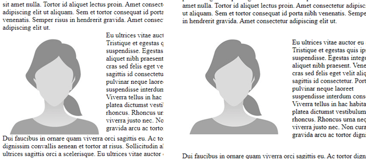
- Be mindful of the spacing around images. Text crammed right up against an image looks messy and unprofessional.

- Adjust your line spacing to suit the size of your font. Sometimes you need a little extra space that might not be automatically accounted for by your platform of choice.
- Be careful when reducing the spacing between lines of text, it can quickly become cramped and lead to a very poor user experience.
- If your platform of choice gives you a visual builder, consider how your content is best broken down, whether it be into larger sections, smaller rows, or whatever your platform has.
2. DON’T forget to compress your images
While it’s not the first thing that comes to mind when you think of web design, the size of your images can have a huge impact on the user experience of your site; particularly if you have a large amount of images.
No one likes to wait; in fact according to Kissmetrics, 47% of people visiting your site expect it to load in less than 2 seconds, and 40% of those people will leave if it takes more than 3 seconds.
As you probably already know, Australia’s internet speed varies widely and is downright terrible in some places. Keeping the size of your images to a minimum is a great way to reduce load times.
How do you go about reducing image file sizes? Well, the easiest way I’ve found is a handy little tool called TinyPNG. Just drag and drop your image, and if the size can be reduced, it will. I’ve noticed an average file size decrease of around 70-80%.
3. DO choose an easy to read font
Sans Serif or Serif?
This question isn’t as clear cut as it used to be. Not all that long ago, lower screen resolutions meant that devices had trouble rendering serifs and, as such, a sans serif font was the better choice for a clean and easy-to-read typography.
However, that’s no longer the case. The Samsung Galaxy s20, for example, has a screen resolution of 3200 x 1440, which is a far cry from the days of 1920 x 1080 being the standard for High Definition.
What does this have to do with choosing your font? Well, it means that serif fonts are a viable choice, as screens can cleanly render out the serif without negatively impacting the experience of the user.
Add to that the emergence of new, modern serif fonts that have been designed for use on screens (as opposed to the older serif fonts that were designed for print) and you suddenly have access to a whole new range of fonts.
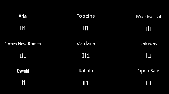
The Il1 test
(That’s capital “i”, lower case “L” and the number “1”)
This is a good place to start when picking fonts. Your font should have easily distinguishable characters and these three are the most common ones that are hard to differentiate between. Here are some examples:

To Descend or not to descend?
This is another thing to consider when choosing your font: do you want your font to feature numbers with descenders? That is, do you want numbers that hang down below the normal line height as with a lowercase “g”?
Some examples to show what I mean would be:

This point is especially important to consider if your website is going to feature numbers quite prominently. For example, this could be a particularly important eCommerce web design tip, where numbers will be prominently displayed in the prices of products.
There’s definitely a place for them but, as with everything in web design and development, it may not suit every design. I know some people have VERY strong feelings about descending numbers, but it’s something to take into consideration for your particular design.
4. DON’T ignore contrast
As a web designer, contrast is one of your best friends. Along with whitespace, it’s one of the elements that will have the most impact on your design looking and feeling good. It’s also arguably the best way to draw the user’s eye towards your conversion action, whether that be a Call-To-Action (CTA), a Contact Form, or something else.
Unlike whitespace, there are specific rules for contrast laid out by the World Wide Web Consortium (W3C) to make sure your website is accessible to people with vision impairment.
WebAIM has a handy Contrast Checker tool on their site. It compares your foreground and background colours and will either pass or fail the ratio of the two colours based on W3C’s Web Content Accessibility Guidelines (WCAG).
A ratio of 7:1 will pass all of the checks. That’s not to say a ratio lower than that is unreadable, but some of your audience may have difficulty with it.

For context, this white text on a black background, has a ratio of 21:1. The absolute highest contrast you can get. And the blue headings on the black background have a contrast ratio of 16.81:1.
So what’s the benefit of all this? Contrast isn’t just useful to those with vision impairments. If properly used, it will help people quickly pick out the key points of your message, guide them to your CTA, and help colour-blind users interact with your website.
5. DO take special needs into consideration
Following on from the topic of contrast, take any special needs your audience might have into consideration. Of course, it would be extremely difficult to create a site that caters to the needs of every single person. Knowing your audience is key for this, as it can inform you as to which groups of people are most likely to come across your site.
As a starting place, consider the following points. Not only are they useful for someone with special needs, but they either improve the experience for everyone, or have other benefits like helping your site’s SEO.
- Apply Alt text to all your images. A vision impaired person may not be able to clearly make out an image. But if it has accurate and descriptive alt text, then that text can be read out aloud by screen readers.
- Be mindful of your colour choice. The most common colours a colour-blind person may not be able to distinguish are those in the red and green spectrums. That’s not to say you should never use these colours, but just be mindful of it when you do use them.
- Videos can be complemented by using transcripts and subtitles. A transcript can be read by users or screen-readers to aid both the vision and hearing impaired.
6. DON’T forget about the meaning of colours
 Also sometimes called colour psychology, this is how different colours can draw out different emotions from the viewer. In practice, it can also help you decide which colour would work well for your theme or which colour to use for your Call-To-Action.
I’m not going to go into a full breakdown of what each colour means, there are already many articles out there on this subject. But here’s a little tidbit I haven’t seen mentioned very often in those articles:
Perhaps even more important than knowing what your colour means, is knowing what impact the brightness of your colour will have.
Bright colours will always appear more energetic and exciting, whereas darker colours will seem more subdued and serious. It’s important you know the tone you’re trying to set and the message you want your audience to receive.
7. DO use a vector format image for your logo
And, finally, I’ll close with a simple tip. If possible, always use a vector image for your website logo. This is an important element to get a better responsive web design.

What is a Vector?
A vector is a type of image file. But instead of using pixels to create the image, it uses points, lines, and curves that are backed up by mathematical equations.
What that means is that a Vector image can perfectly scale to any size without becoming blurry or losing clarity. This is important because having a blurry logo as a result of a small image being stretched, or a large one being compressed just looks bad and unprofessional.
A vector image will resolve both of these problems and, to reference back to one of my previous points, the file size of a vector image is tiny. Instead of having to store hundreds or thousands of pixels, it just has to store a few numbers and lines, making it the smart choice for your logo.
How do I get a Vector logo?
Most graphic design software will be able to export your image in a vector format. Most commonly this is an .EPS file (Encapsulated PostScript) or .SVG file (Scalable Vector Graphics).
And there you have it!
Seven things to think about while you’re coming up with your next website design. With these tips you’re well on your way to making a beautiful, accessible, and responsive website.
By making use of my tips you can draw the eye of the audience where you want it and ensure they have a good user experience. Not only that, you will make sure that anyone with special needs has an equally awesome experience with your site.
If you want to discuss the design or structure of your website, click the button below to get in touch!


