As Refuel’s web developer, I was given the opportunity to head up the project to revive the Refuel Creative website. To make sure the website not only worked for us, but for our existing and prospective clients, I put in many, many, many hours into designing and developing the site. Now, after hearing positive feedback about it, I’m keen to share a bit more about what went on behind the scenes.
This Refuel website redesign was more than a means of increasing conversions and lead generation - it was an opportunity to share our story and take a deeper dive into our capabilities. It tells our (current and potential) clients that they are at the forefront and the heart of what we do.
Being intentional about UI
We wanted to make sure the website had the best user experience, so I committed time to research and interview some of our clients on what they thought was needed from a marketing agency website. Taking the insights from our research and interviews, I conducted several design-thinking sprints (which are short, boxed time periods to complete a set of specific tasks or goals) to address our key challenges using User Interface (UI) design:
- Clarify our personality and messaging
- Site navigation and user-journeys
- Demonstrate our digital marketing expertise
Through this iterative process, we were able to develop a solution that balanced our bold brand identity with clear, user-friendly design for digital marketing agencies.
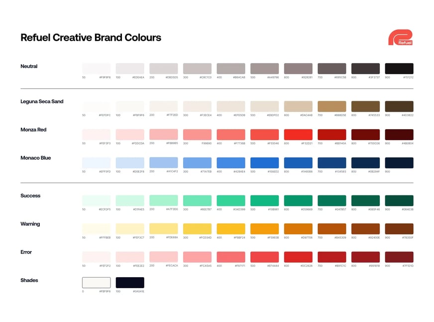
Brand colours
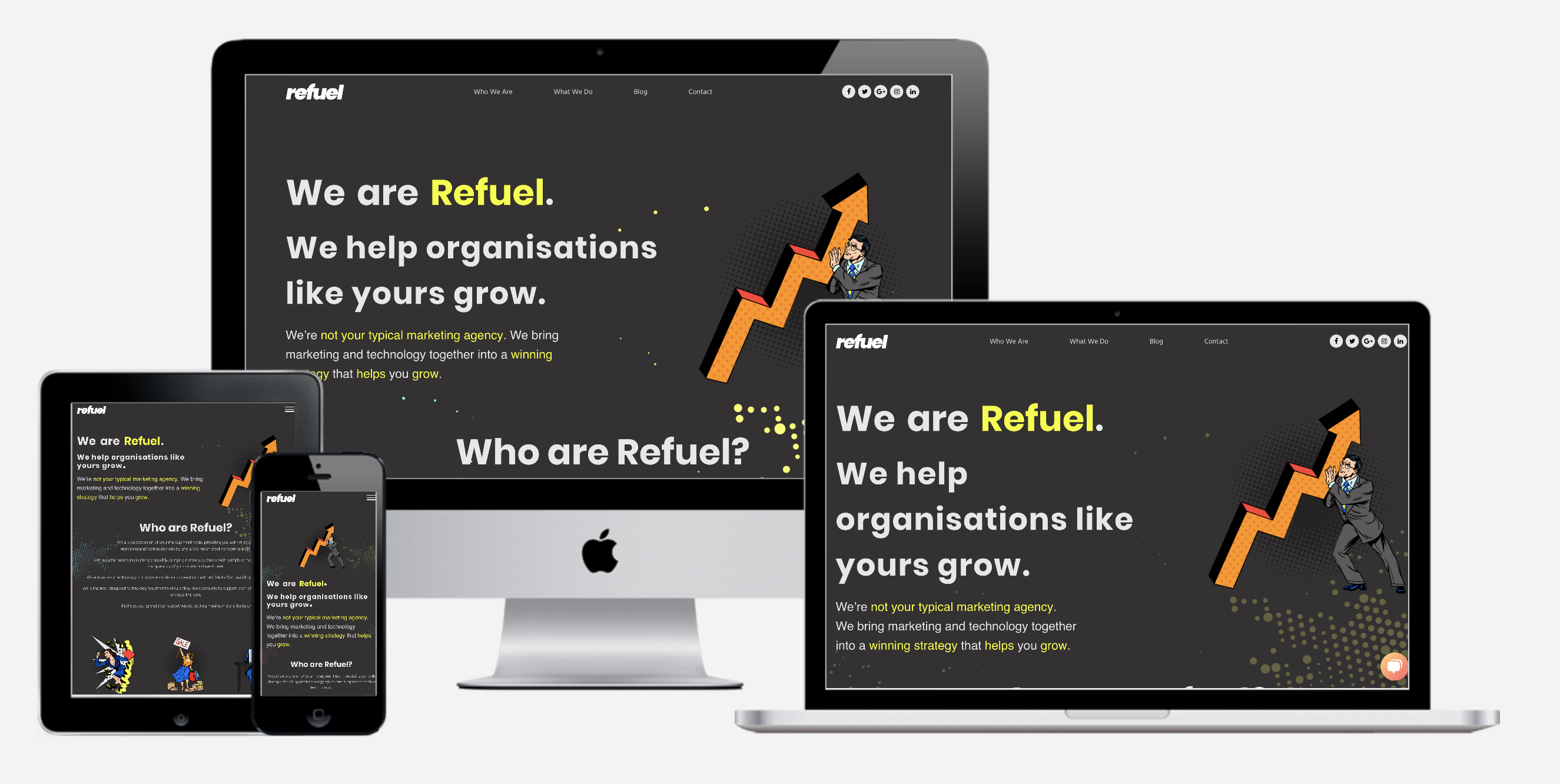
Our brand colours got a refresh with carefully selected tints and shades to improve accessibility while maintaining visual interest. This expanded palette allowed us to use colour more intentionally throughout the site, enhancing our storytelling and guiding users through different sections.
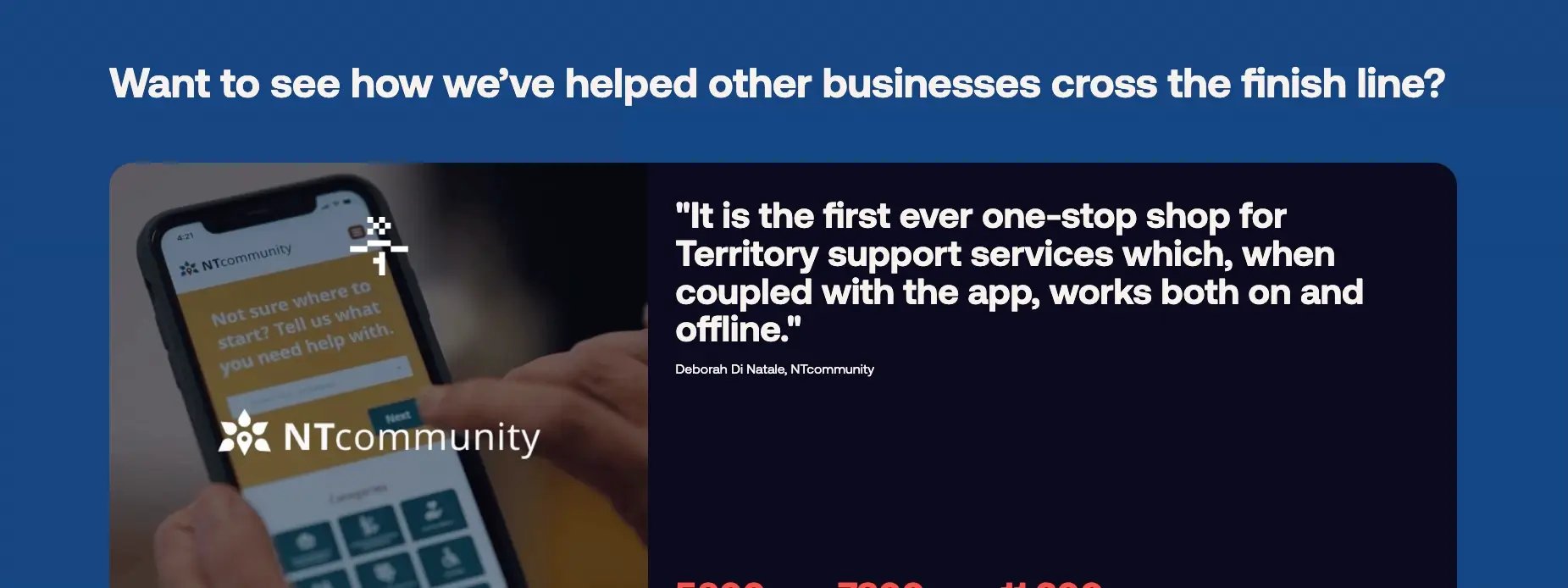
Card-based layout system
We introduced a new card-based layout system for showcasing our services and team members, making it easier for visitors to digest information at a glance. Key information like case studies and snapshot statistics now stand out with dedicated highlighting, making it easier for time-pressed visitors to find the most relevant information quickly.


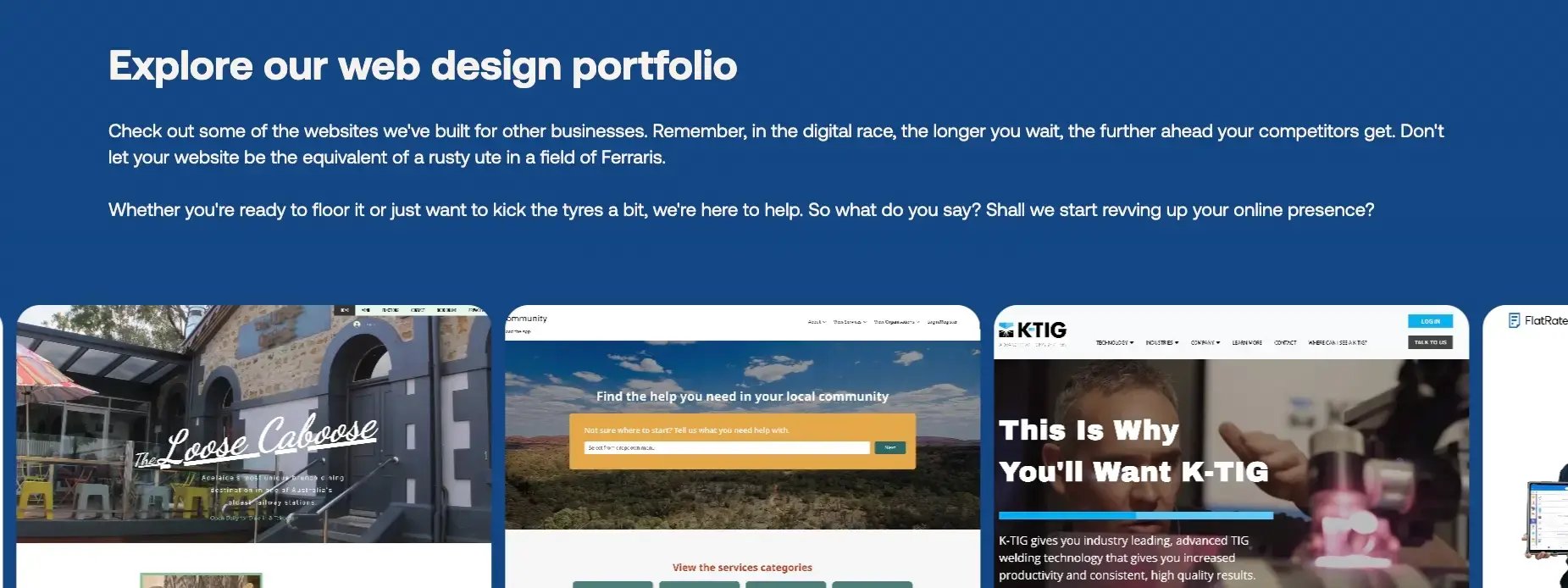
Showcasing what we do
When it came to our service pages, our previous design left much to be desired. So, much consideration was given to ensure that our extensive knowledge was presented in a more digestible way. We did this by adding more images and visual elements (like icons and roadmaps), as well as being more consistent with spacing.
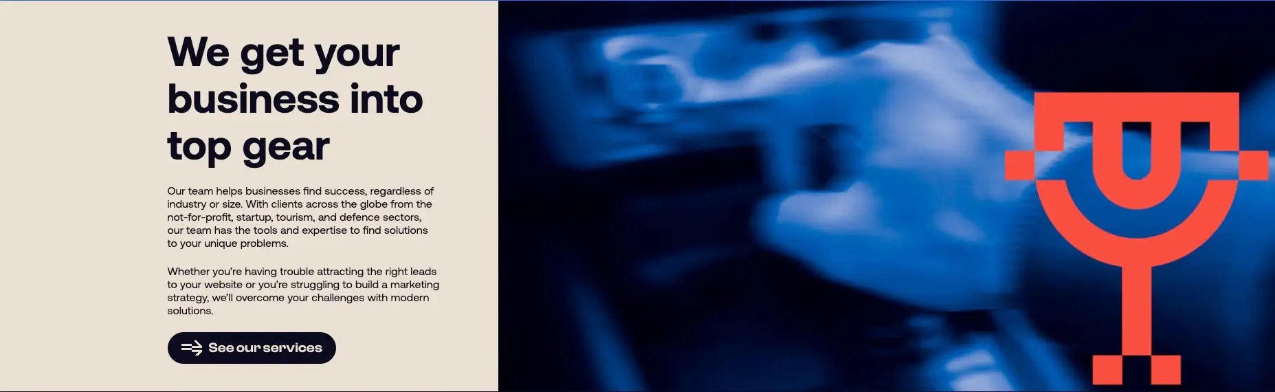
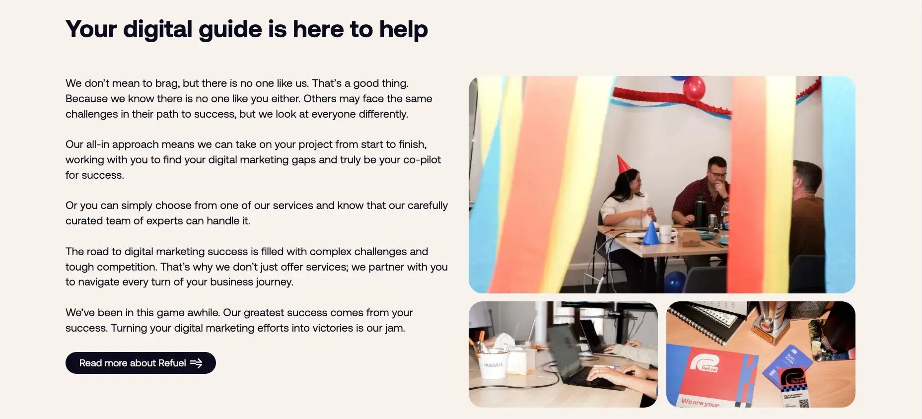
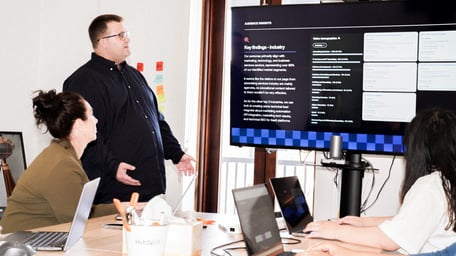
Visual representation of who we are
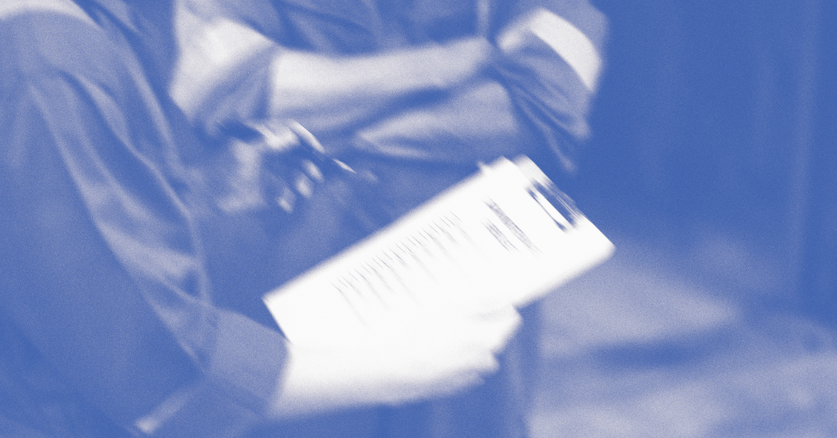
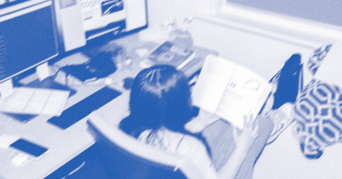
A big focus of this design was including photos that were a reflection of who we are. We moved away from abstract racing graphics to incorporate more engaging photos, making the site feel more approachable and relatable.
Before:
After:
It was a lot of trial and error to find a photographic style that we could call our own, but we rose to the challenge and it paid off. With a flash and a lot of jolting to create high-contrast shadows and (very intentional) blur, we captured some awesome moments that added a personal touch to our website. And we didn’t stop there. In the editing studio, we enhanced the contrast, brightened the whites, and added loads of grain to give these photos more of a vintage vibe, similar to that of vintage F1 posters.

(Images sourced from Google)

Maximising HubSpot Content Hub
When it came to building the site in the HubSpot Content Hub, I wanted to ensure we created something that wasn't just visually appealing but also technically robust and user-friendly for our team. I had already created two themes (which are now available on HubSpot Marketplace), so there was familiarity with what goes into creating a fully custom theme.
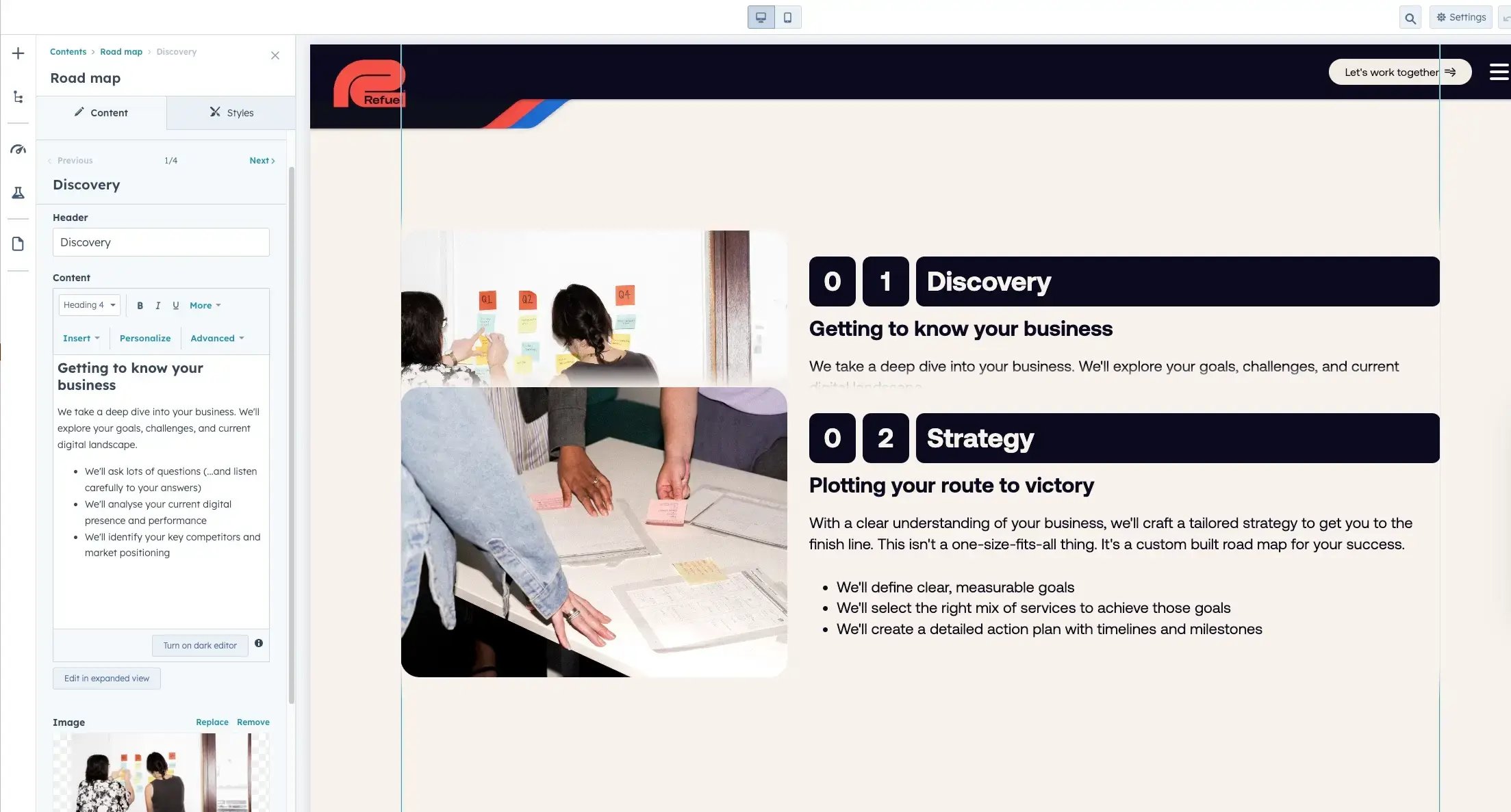
A major focus during development was implementing a comprehensive design system. This ensured consistency across all site elements, from typography and spacing to component styling. I created a library of custom modules that were intuitive for our team to use, making it easier for everyone to maintain the site's visual consistency while creating new content.
Template development was another crucial aspect of the build. I designed and built a suite of flexible templates that our team could easily use to create new pages without needing to start from scratch each time. This not only improved our efficiency but also maintained design consistency across the site.
Throughout the development process, I made it a priority to stay current with HubSpot CMS's latest features and capabilities. This allowed us to maximise the platform's potential and implement innovative solutions that would benefit both our team and our visitors. One example of this is being able to load custom fonts inside the theme. Now, instead of using @font-face or loading fonts in the theme files, our fonts would be available inside text editors.


There were a lot of elements that would be placed on multiple pages, so I put a lot of work into using HubDB to centralise the content, and creating modules to dynamically display this data. HubDB is a really cool HubSpot tool for storing data in a spreadsheet format, which can be utilised in emails and web pages. We created HubDB tables for:
- Social media accounts
- Team members
- Case studies
- Services
- Locations and contact numbers
This allows the team to edit content in one place, ensuring that pages with similar components are always up-to-date.

A website built for you
Now that we are truly in the midst of our launch campaign, we hope that you can see the investment and dedication we’ve put into this website, and how we can give that back to you. We’re continuing to improve this website, so we invite you all to keep an eye on this space.
If you’d like to see how Refuel can power your websites, read more on what we can do for you.